Discover interactive dashboards and custom solutions designed to turn insights into results
In this section, you’ll see how we turn data into strategic decisions—through real, working solutions.
Our portfolio was designed to demonstrate the value of business intelligence solutions in an interactive and accessible way. We invite you to explore, experiment, and discover how data-driven strategies can support decision-making across different business contexts—with a focus on performance, usability, and real impact.
Here, you’ll find examples of visual reports, interactive dashboards, and other intelligent solutions developed with advanced design techniques, data integration, and a strategic approach to information.
We believe the best way to understand what we do is to see it in action. So feel free to navigate, interact, and imagine how we can deliver a custom BI solution tailored to your business needs.
Absolutely. Each project shown here was developed with a focus on the specific needs of our clients. We can also build a tailored solution for your business—bringing together data, technology, and strategy to deliver real results.
It all starts with understanding your data challenges. DatabyteiQ works closely with you to identify opportunities, organize your information, and turn your data into a valuable asset for smarter decision-making.
Yes! Our solutions are flexible and can be adapted to different business sectors. We’ve already worked with industries like construction, marketing, finance, and logistics—and we’re always ready to learn about new business needs.
Any Questions? Let’s talk
Send us your question and we will respond as soon as possible.
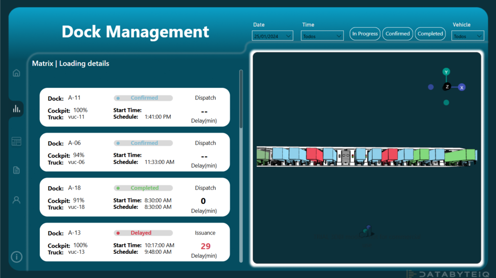
This Power BI report was developed to provide a comprehensive and detailed view of logistics operations within a distribution center with 19 docks. It tracks, on a daily basis, the status of shipments, scheduled times, operation start and end times, as well as key metrics like load type and quantity. The report is designed to support the needs of operational supervisors, logistics managers, and planning teams, enabling faster decision-making, improved productivity control, and the anticipation of operational bottlenecks.
Technical Note: This report integrates with a SketchUp extension and includes visuals rendered in SVG format.
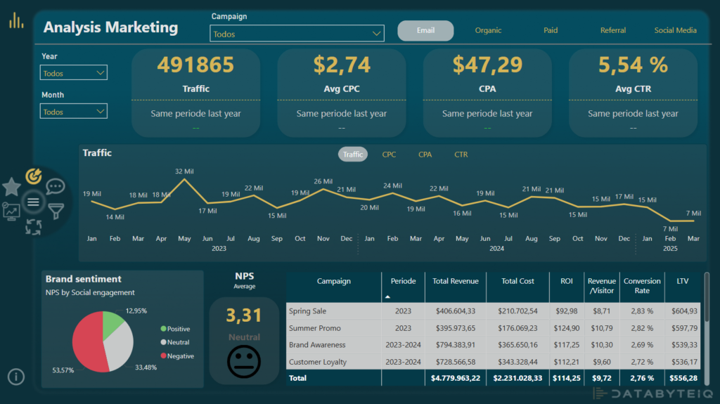
This report provides a consolidated view of the performance of digital marketing campaigns carried out between 2023 and March 2025. Through key metrics such as website traffic, social media engagement, conversions, cost per acquisition, and brand sentiment, it’s possible to assess the effectiveness of the strategies implemented over time.
The data is organized by campaign, channel, and period, making it easy to identify which efforts delivered the best results. Built in Power BI, the report offers a visual and interactive analysis experience—even for those without a background in data tools—enabling faster and more informed decision-making.
Technical note: This report integrates native Power BI visuals as well as custom visuals in SVG format.
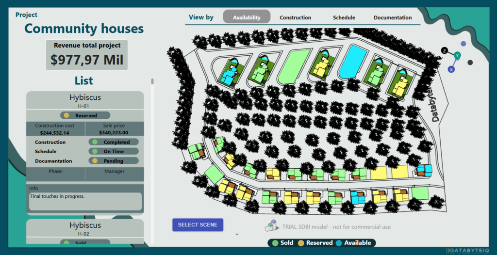
This interactive report was designed to provide a clear and updated overview of a housing project’s progress, even for those unfamiliar with data tools. It allows users to easily follow the construction status, sales availability, documentation progress, and details such as the construction cost and final selling price of each unit. It also shows where each house is in the construction process and who is responsible for that stage.
The main goal is to support smarter, faster decisions by project managers, developers, investors, and sales teams, with instant access to the information that matters most: financial control, deadline tracking, and legal or technical documentation status.
This dashboard helps improve visibility and efficiency in project management, becoming a strategic tool for monitoring progress, reducing risks, and optimizing sales efforts. No technical background is needed to explore the information — just point, click, and analyze.
Technical Note: This report integrates with a SketchUp extension and includes visuals rendered in SVG format.
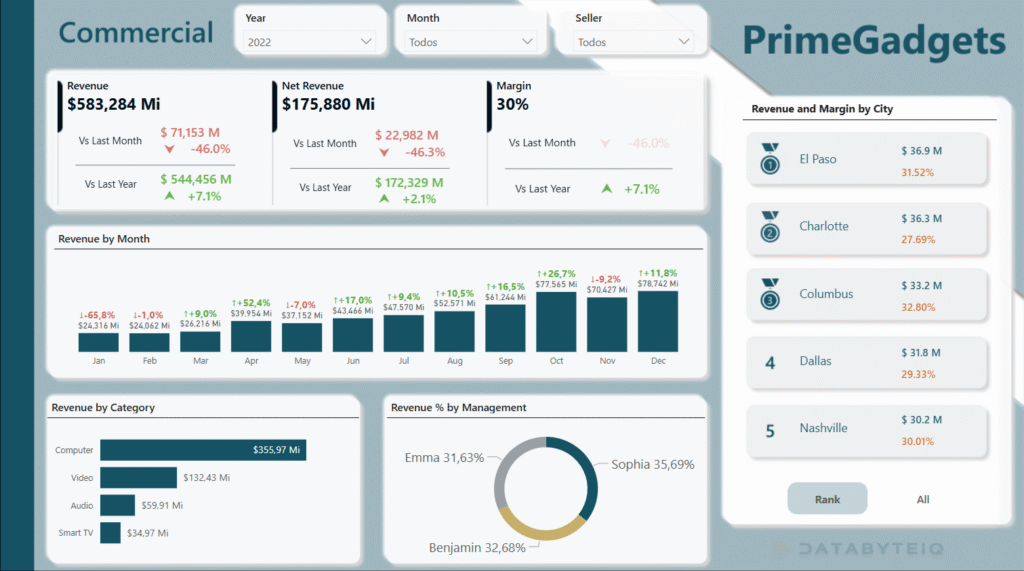
The sales report was developed using a data visualization platform, based on a comprehensive sales database, with the goal of transforming commercial and financial information into strategic insights. The solution enables users to view monthly revenue performance, analyze the productivity of each manager and their team, compare targets with actual results, and track financial indicators with clarity and accuracy. It is an essential tool for supporting faster, smarter decision-making by connecting data to performance management. Sales professionals, commercial managers, financial analysts, and executive leaders are among the key audiences who can benefit directly from this type of report. The dashboard also includes several visual features, such as customized tooltips, that provide additional context and details (just hover over the indicators to explore more).
Technical note: This report integrates native Power BI visuals as well as custom visuals in SVG format.
Our Testimonials
Título
Parágrafo
Lorem ipsum dolor sit amet, consectetur adipiscing elit, sed do eiusmod tempor incididunt ut labore et dolore magna aliqua.
Cras phasellus faucibus provident occaecat praesentium, iusto nunc cursus! Ac morbi architecto tincidunt curabitur
Lorem ipsum dolor sit amet, consectetur adipiscing elit, sed do eiusmod tempor incididunt ut labore et dolore magna aliqua.
Cras phasellus faucibus provident occaecat praesentium, iusto nunc cursus! Ac morbi architecto tincidunt curabitur
Absolutely. Each project shown here was developed with a focus on the specific needs of our clients. We can also build a tailored solution for your business—bringing together data, technology, and strategy to deliver real results.
It all starts with understanding your data challenges. DatabyteiQ works closely with you to identify opportunities, organize your information, and turn your data into a valuable asset for smarter decision-making.
Yes! Our solutions are flexible and can be adapted to different business sectors. We’ve already worked with industries like construction, marketing, finance, and logistics—and we’re always ready to learn about new business needs.
Any Questions? Let’s talk
Send us your question and we will respond as soon as possible.